your healthiest self
explored how a digital product could simplify and support users in navigating their personal health journeys. through user research and insight synthesis, identified key pain points and opportunities to design a more empowering, streamlined health management experience.
the inspiration
we've all been there. lying in bed, watching an inspirational video that convinces you to start a new health journey. and it usually works... for a few days, until the motivation fades.
the truth is, navigating your health journey is hard. in fact, an article from inc.com shared that only 8% of people actually achieve the health goals they set for themselves (yikes!). that's why i created your healthiest self, a digital tool designed to help users manage their wellness journey with more structure, support, and sustainability.
health-oriented individuals want a better way to manage their mental and physical health goals, so they can more effectively achieve them.
your healthiest self is a comprehensive tool that allows users to achieve both their mental and physical health goals. many existing apps separate the two, but by prioritizing both, your healthiest self reaches a larger customer base.

background research
before jumping into any designs, i wanted to explore existing solutions to understand what they did well and where they fell short. i identified two main competitors: notion and myfitnesspal.
i looked at notion, an online workspace tool designed to help improve productivity, and myfitnesspal, an app focused on helping users meet their health goals.
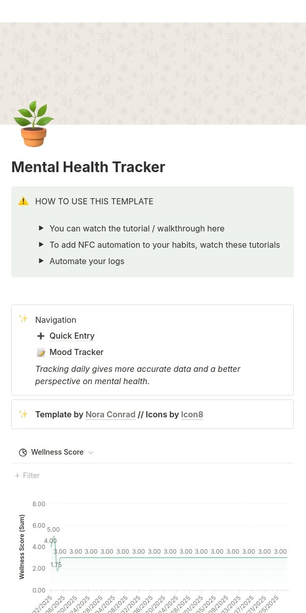
notion
pros
- many templates - great for personalization
- reflection, physical, and mental health templates
cons
- lack of statistics for users to evaluate progress
- have to make their own if user dislikes options
- the amount of options can be overwhelming
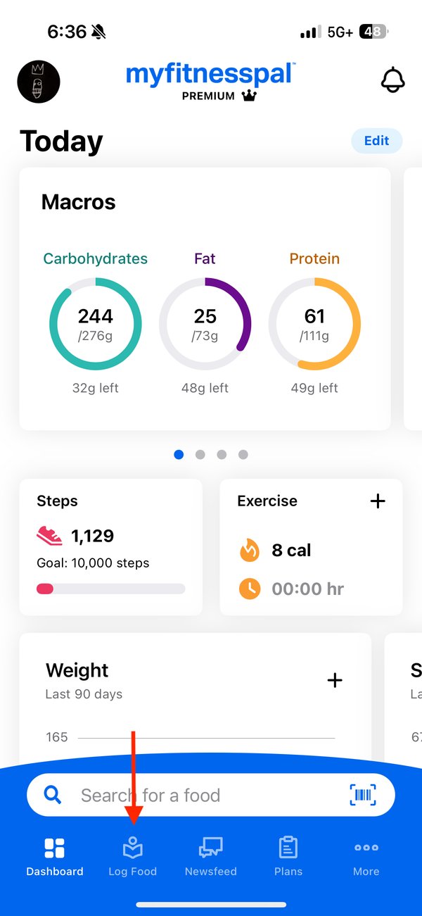
myfitnesspal
pros
- extremely thorough and provides nutritional data
- progress bar and metrics to provide clarity for users
- discover page makes it simple to find new recipes + workouts
cons
- provides a general pre-made goal list instead of allowing users to create their own
- no mental health features and many disabled features unless user pays
user research
after conducting background research, i wanted to better understand the users i was designing the app for. to do this, i created user personas, wanda the wellness enthusiast and brandon the beginner, to guide my design decisions throughout the process.
 user persona 1
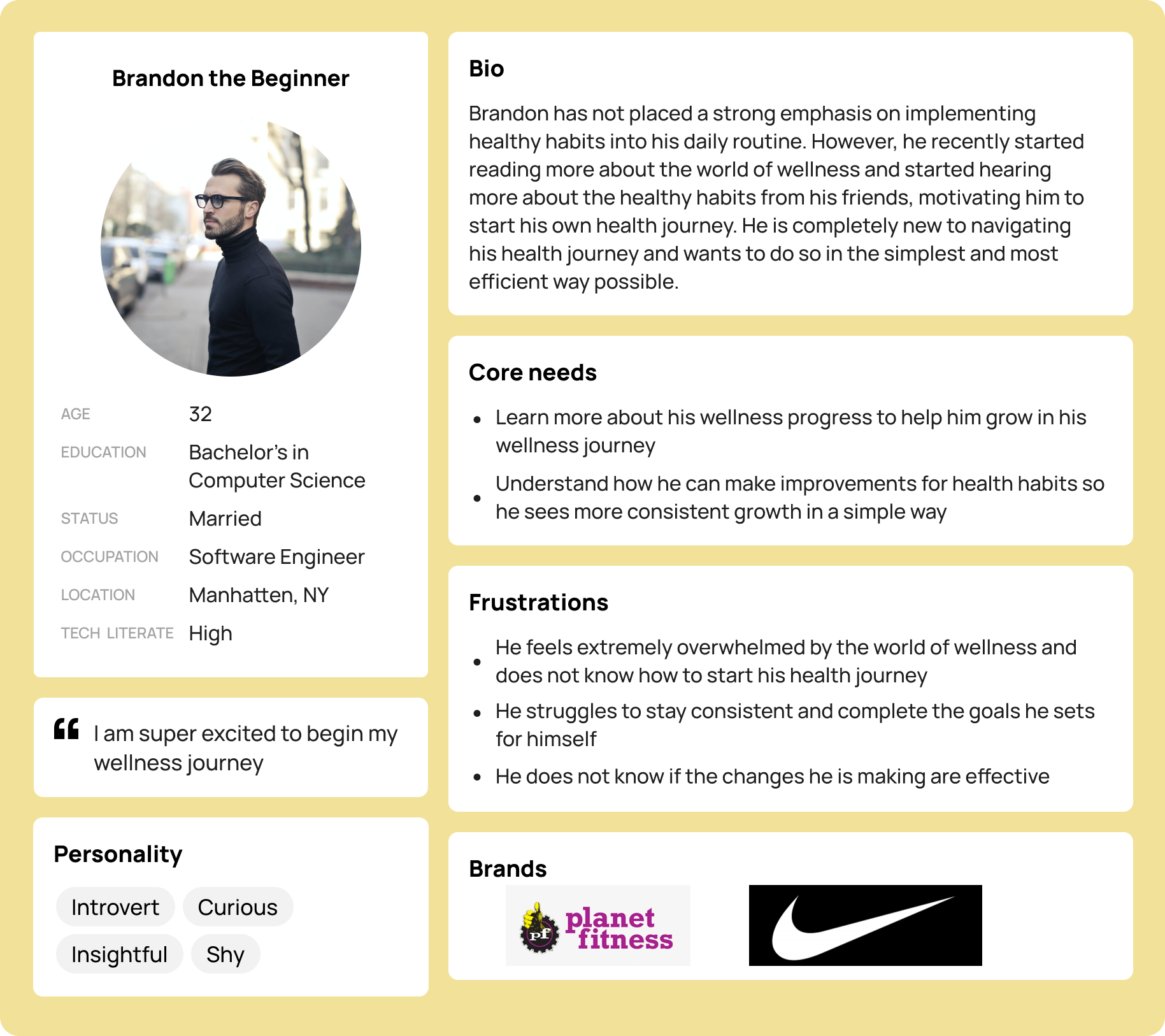 user persona 2
ideating designs
before jumping into wireframing, i first identified key elements that would help users successfully achieve their health goals. researching what features support users and why they're effective helped ensure that my designs directly addressed the problem i set out to solve. from this, i identified core components for your healthiest self:
goals to-do list
a study from the dominican university of california found that individuals who write down their goals are significantly more likely to achieve them compared to those who don't.
progress metrics
research by the american psychological association shows that tracking your progress increases your chances of successfully reaching your goals.
habit tracker
a study published in frontiers in psychology explains that digital habit trackers can improve self-control and make it easier to build lasting habits.
mood tracker
research by david bakker, nikolaos kazantzis, debra rickwood, and nikki rickard shows that mood tracking apps help boost users' mental well-being.
reflection journal
a study by harvard business review found that individuals who regularly reflected on their performance improved it by 18%.
overall, these studies highlight how individuals can better follow through on the goals they set for themselves. by incorporating these features into your healthiest self, i aimed to create a product that supports real, actionable progress in a user's mental and physical health journey.
using what i learned from identifying key elements for the app and evaluating the needs of my main personas, i created an information architecture diagram to guide the structure of the wireframing stage.
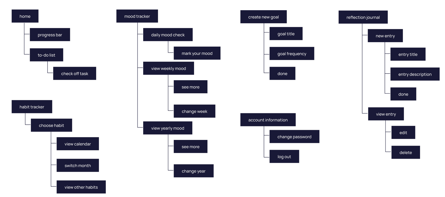 information architecture
once i had created the information architecture, i set out to wireframe designs for the main actions listed in the diagram.
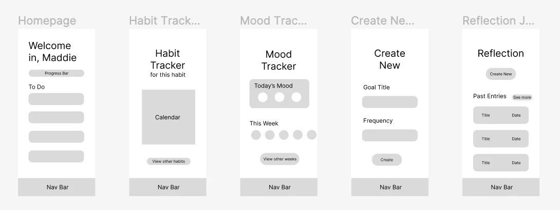 key wireframes
when creating my high-fidelity prototypes, i chose a color scheme with green as the primary color.
why? color psychology often associates green with growth. this aligns with the core purpose of your healthiest self, which is to support users in their journey of personal growth.
design choices
as i continued working on my designs, i made several design choices to bring my high-fidelity prototypes to life.
originally, my reflection journal page displayed all entries on the main screen alongside the “create new entry” button. i updated the layout to include a separate “view all entries” button. this made the screen less overwhelming and helped prioritize the “create new entry” button, encouraging users to reflect more frequently.
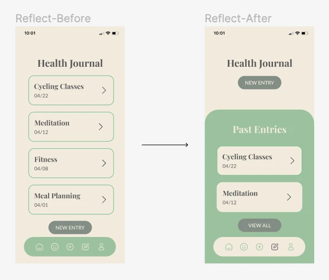 reflection journal: before and after
originally, my habit tracker page only included a non-interactive calendar widget. i updated the design to display statistics showing how often a user completed a habit and whether they had achieved their goals. this helped users better visualize habit patterns and track progress over time. i also made the calendar interactive, allowing users to log habits retroactively in case they forgot to check them off on a previous day.
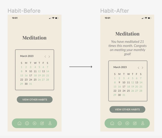 habit tracker: before and after
usability testing
once i had created my high-fidelity screens, i moved into the user testing phase to gather feedback from real users. here were three key insights i uncovered during usability testing:
- the navigation bar felt overwhelming and increased cognitive load
- there was a lack of meaningful data, which limited the app's usefulness in tracking progress
- users were prone to errors when trying to delete journal entries
from these insights, i made several design updates in the next iteration, including:
added yearly and monthly statistics to the mood tracker to help users better understand how their mood has changed over time.
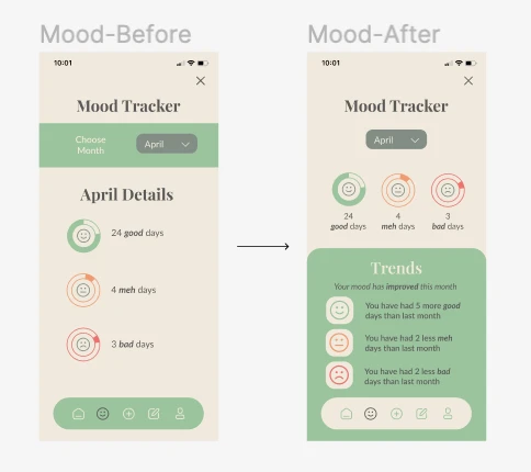 mood tracker: before and after
adjusted the information architecture by integrating the habit tracker into the progress widget on the homepage for easier access and a more streamlined experience.
 navigation bar: before and after
added a confirmation page to the reflection journal to reduce the risk of users accidentally deleting an entry.
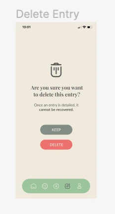 delete entry confirmation
the final product
and now, the moment you've all been waiting for... here is the final product! below are some of the key features from my high-fidelity prototype, or you can view the full figma prototype.
reflection + next steps
this was such a fun project to complete! as someone passionate about self-improvement, it was exciting to design an app that aligned with that interest. it also served as a great learning experience that challenged me to grow as a designer.
don't assume, ask
continually asking questions helped me better understand users' thought processes and informed design decisions that improved the overall experience.
iterate, iterate, and iterate again
my final prototype looked very different from my original information architecture. by constantly iterating, i was able to address pain points and strengthen the design at each step.
prioritize the user
i realized how important it is to conduct user research before jumping into design. while i eventually gained strong insights, starting with user interviews would have helped guide the process more efficiently and made the product even more user-centric.
but no design is ever truly finished. here are my next steps for this project:
- build a resources page with blog posts and youtube videos to help users stay motivated and informed
- add a community section so users can connect with others focused on health and wellness
- get the app developed and into users' hands!