vvwh sharepoint redesign
redesigned an internal sharepoint site for von voigtlander women's hospital to help clerical staff find critical information faster.
impact
the problem
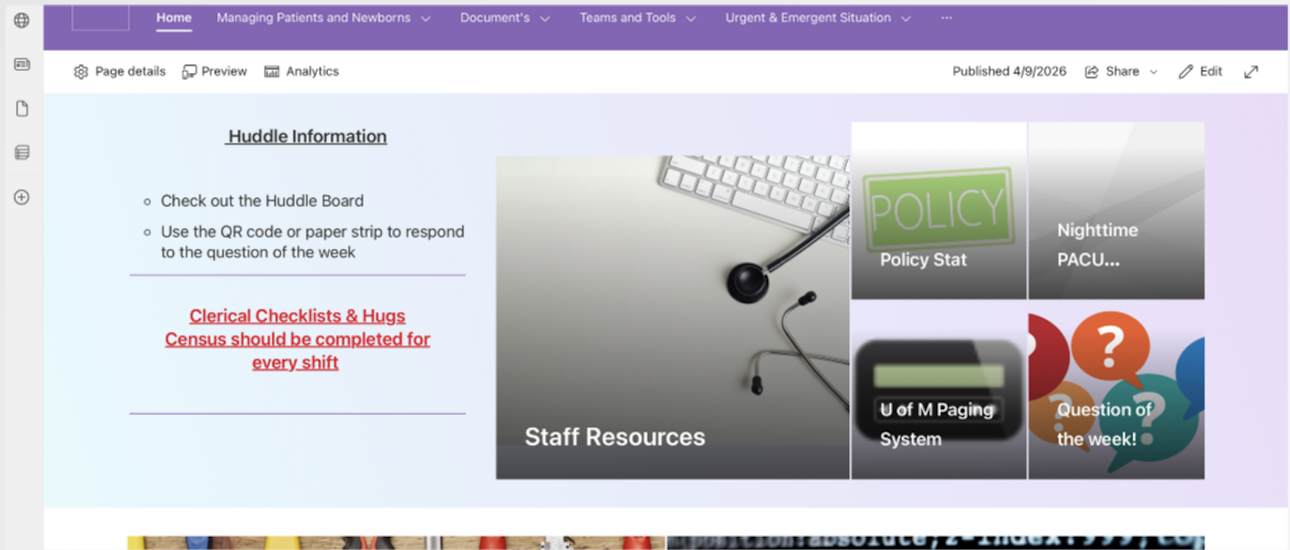
von voigtlander women's hospital clerical staff rely on an internal sharepoint site throughout their workday to access forms, patient resources, emergency procedures, and other important information.
over time, the site had become cluttered and difficult to navigate. staff often had to search, click through multiple menu levels, or ask coworkers where information lived.
how might we make critical hospital information easier to find without requiring staff to memorize where everything lives?

user research
before redesigning the site, we needed to understand how clerical staff currently found information, where they got stuck, and how they mentally organized their work. we used a mix of qualitative and quantitative methods.
survey responses
contextual interviews + task walkthroughs
card sorting activity
heuristic evaluation
research themes
interview and survey findings were synthesized into recurring themes around navigation, content structure, search, and user control.
click a theme to see the research notes behind it.
what we learned
navigation didn't match how staff thought about their work
staff thought about the site in terms of tasks like admitting patients, finding forms, or responding to emergencies. the existing sharepoint structure was organized around system categories and document types instead.
search had become a workaround
because navigation was difficult to predict, staff relied heavily on the search bar, sometimes even when they knew roughly where information should be.
inconsistency reduced trust
broken links, outdated information, unclear labels, and inconsistent page structures made staff unsure whether they were finding the right resource.
research gave us three clear priorities
organize around tasks
structure navigation around the workflows staff actually perform instead of internal document categories.
surface high-priority information
make frequently used and time-sensitive resources easier to reach without repeated searching.
reduce cognitive load
create consistent layouts, clearer labels, and more scannable pages.
early ideas
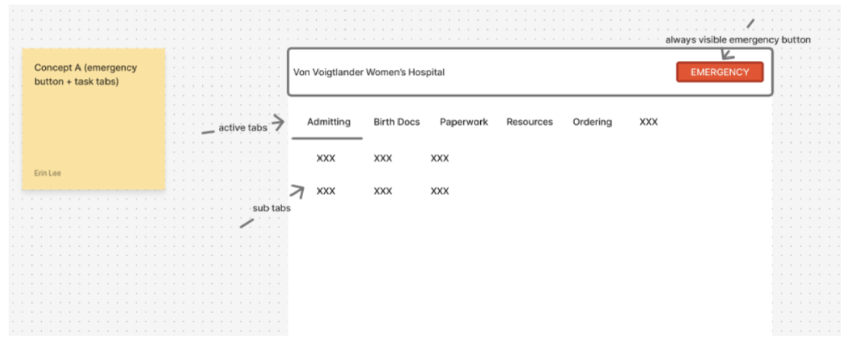
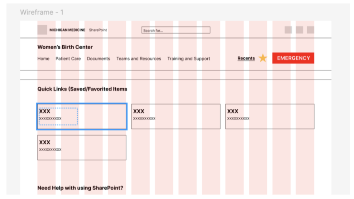
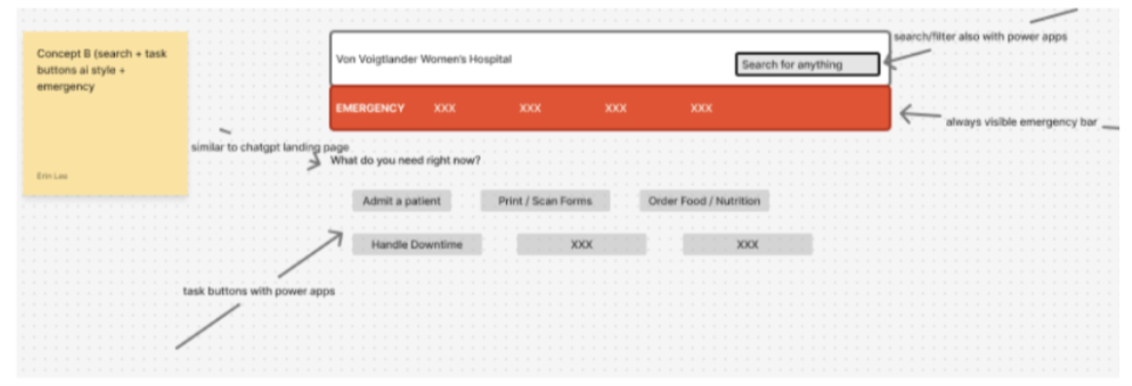
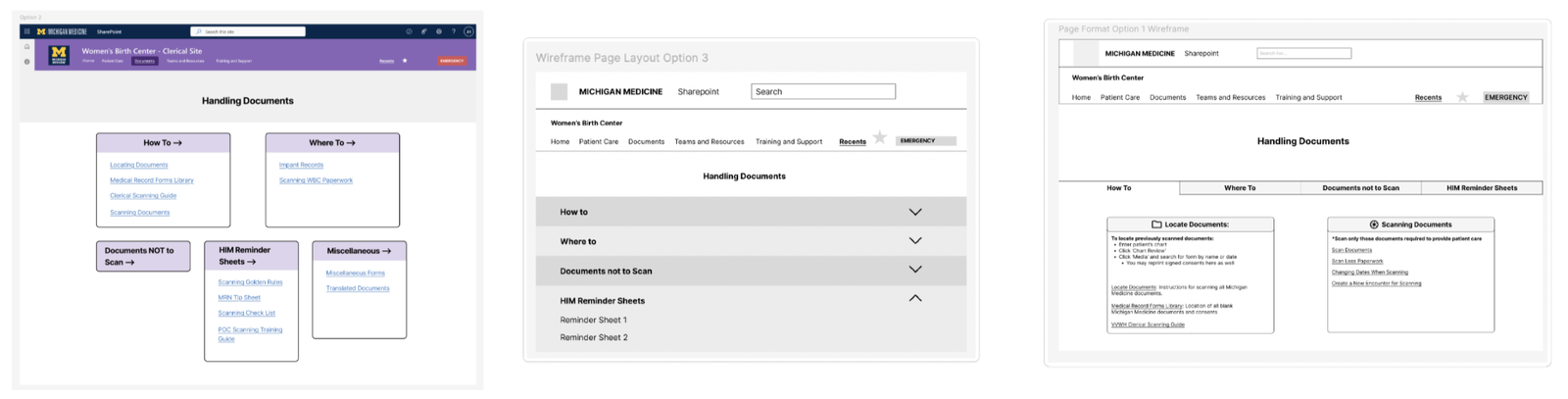
we first explored several ways to simplify navigation, give staff quicker access to frequently used content, and make long pages easier to scan. early concepts included:
- task-based navigation
- saved or frequently used pages
- expandable content sections
- quick links for common workflows
design choices
as we moved from wireframes into implementation, we discovered that several concepts weren't realistic within sharepoint.
| original idea | constraint | revised approach |
|---|---|---|
| vertical navigation | not supported by the existing sharepoint setup | simplified horizontal navigation |
| saved / favorite pages | limited customization | prominent homepage quick links |
| highly customized layouts | rigid page templates | reusable card-based sections |
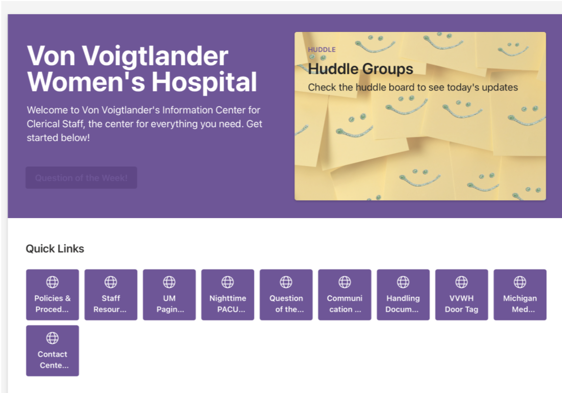
rather than designing an ideal experience that the hospital couldn't maintain, we shifted toward solutions that worked within sharepoint's real constraints.
the final redesign
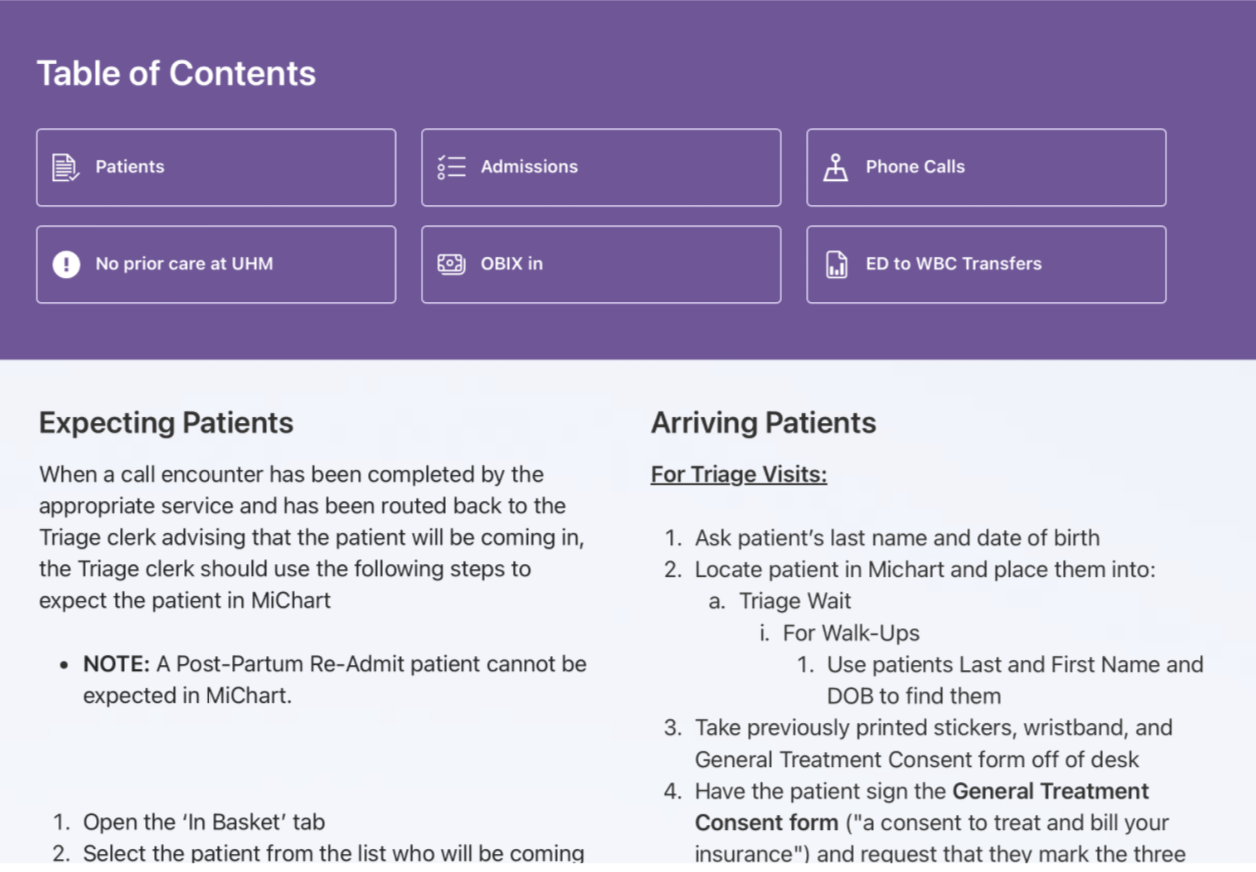
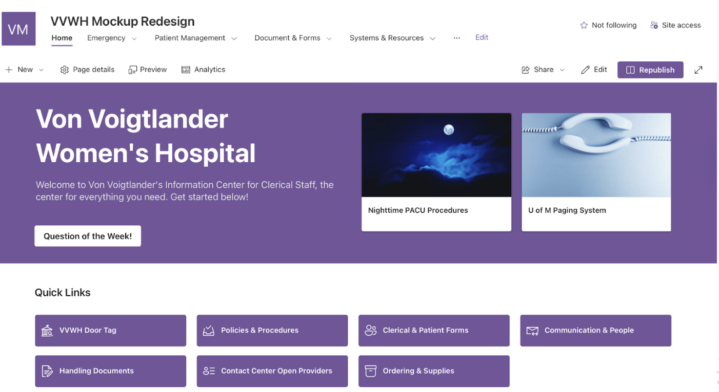
our final redesign focused on three major changes.
task-based navigation
navigation labels and categories were reorganized around the workflows staff already understood.
quick-access homepage
frequently used and time-sensitive resources were surfaced directly on the homepage.
consistent page structures
cards, section-based layouts, tables of contents, and simplified terminology made longer pages easier to scan.
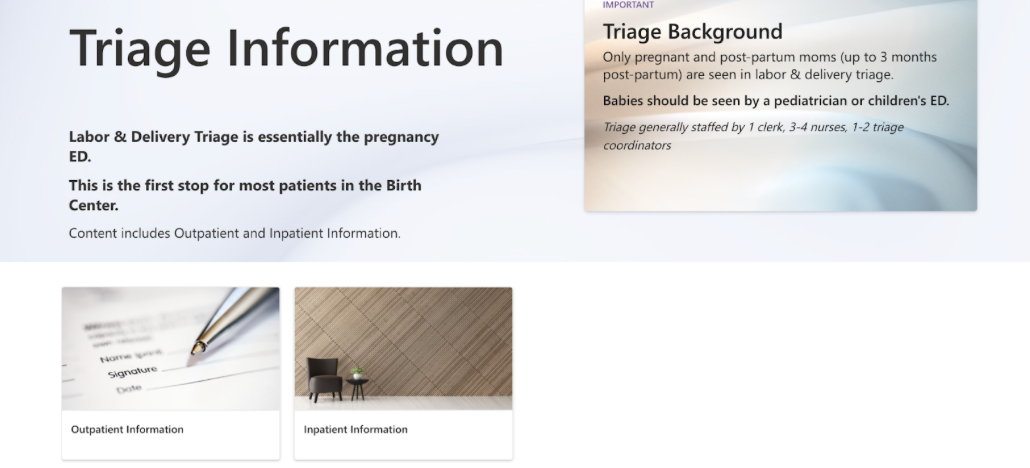
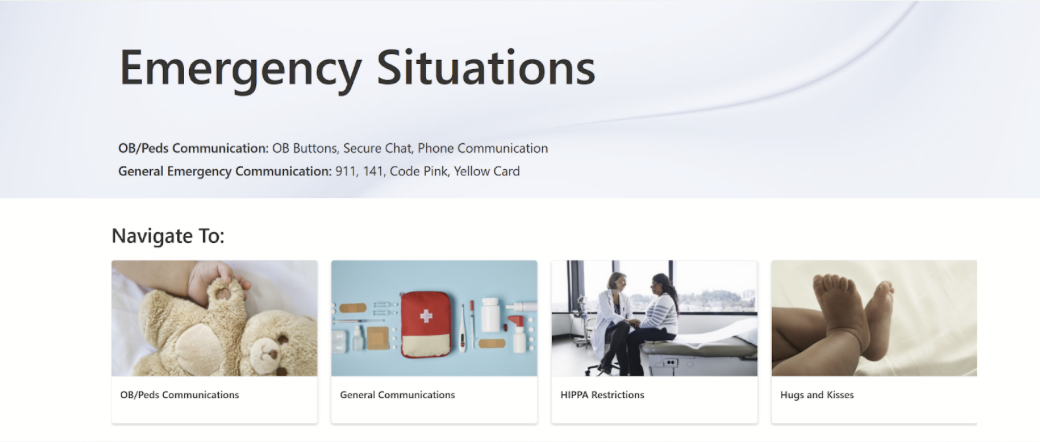
before vs. after
homepage
search
multiple results
scroll through content
ask coworker / retry
homepage
task-based category
relevant page
did it work?
we tested the redesigned experience with clerical staff using realistic navigation tasks and compared their experience with the existing site.
impact
- participants navigated the redesign with less reliance on search
- staff found the redesigned homepage easier to understand
- quick links were seen as particularly useful for newer employees
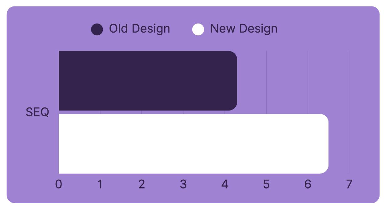
“I could figure things out without the search bar. It's better than the old one.” — usability test participant
what i'd test next
our final usability study involved a limited number of staff members, so the next step would be validating the redesign with a broader sample before full implementation. i'd also continue testing:
- whether the new navigation terminology works across roles
- which homepage shortcuts are most valuable over time
- accessibility against wcag standards
reflection
this project showed me how much product decisions change once technical and organizational constraints become real. some of our earliest ideas offered more flexibility, but they weren't maintainable within sharepoint. instead of forcing those concepts through, we adapted the design around what the hospital could realistically implement and maintain while preserving the core user needs we uncovered in research.
it also reinforced how valuable it is to watch people work rather than relying only on what they say. many of the clearest problems became visible when we observed staff trying to find information in real time.
thanks for reading 😊